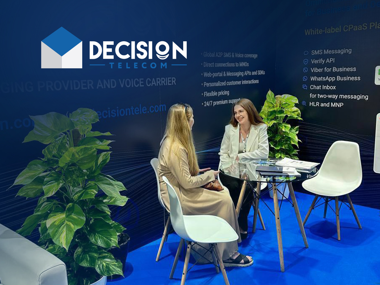
How to effectively present your company at an exhibition using a stand
A significant part of preparation for participation in a business conference is the development of the company’s exhibition information stand. Nowadays you won’t surprise anyone with roll-ups, flags, and booklets. Therefore, brands hire entire teams to create an exclusive and attractive stand that will reflect the company's philosophy and impress potential partners.
The success of his participation in the conference depends on how interesting and vividly the exhibitor presents himself. After all, it is important for any company to get a profit from invested resources. How to be the center of attention at an exhibition - read further.
The purpose of the exhibition information stand
A stand is a business card of a company at business sites. This is a kind of “office on the road”, which will become your territory during the event. It should be noticeable, but at the same time comfortable.
It only takes five seconds for a person to feel interested in an object and make a decision - to pass by or stop. A design that reflects the mood, a certain concept, and positioning of the brand speaks louder than any words. Visual perception plays a huge role in this context, so you shouldn’t skimp on designers and constructors.
However, even the most original and striking exhibition information stand should:
- provide as much information as possible about the exhibiting company;
- talk about the range of services and products;
- communicate about the capabilities and potential of the enterprise.
You need to design an exhibition stand in such a way that no one can pass by. But don’t forget that this is also a meeting place with potential clients and partners: for successful conversations, it is important to take care of the functionality of the design.
How to properly design an exhibition stand
The design of a typical exhibition information stand consists of several zones. Typically this is:
- The presentation part is the central element that is responsible for presenting the brand and product. Must correspond to the corporate style, and colors, and contain the company name and logo. Please note that the readability of elements must be maintained from any angle.
- The meeting area is a place for consultations and cozy conversations with stand visitors. Accommodates a table, sofas, armchairs, or chairs.
- Utility compartment - this area houses the kitchen, warehouse, and wardrobe. It is recommended to plan these areas so that they are not visible. You can hide them behind posters or stands.
- Workplaces. The human factor in a company presentation is very important, so make sure that your delegates feel pleasant and comfortable at your stand. Use branded badges - then the stand staff will also advertise the brand. However, don't turn them into faceless office workers.
Using this zoning, you can beautifully design an exhibition stand and effectively use every meter of it.
Now you know exactly how to effectively present your company at the exhibition. Read more tips and useful information in the Decision Telecom blog!


